Defining THE Garden Centre
Dobbies
OVERVIEW
Dobbies’ wanted an entirely new retail concept to better reflect the core Dobbies brand proposition and to establish a blueprint for future business growth. A holistic view was required to ensure a commonality of language between the new building design, the retail design, the product and the visual communication.
Our connected expertise became the glue that wove all of the design, experience and product together,
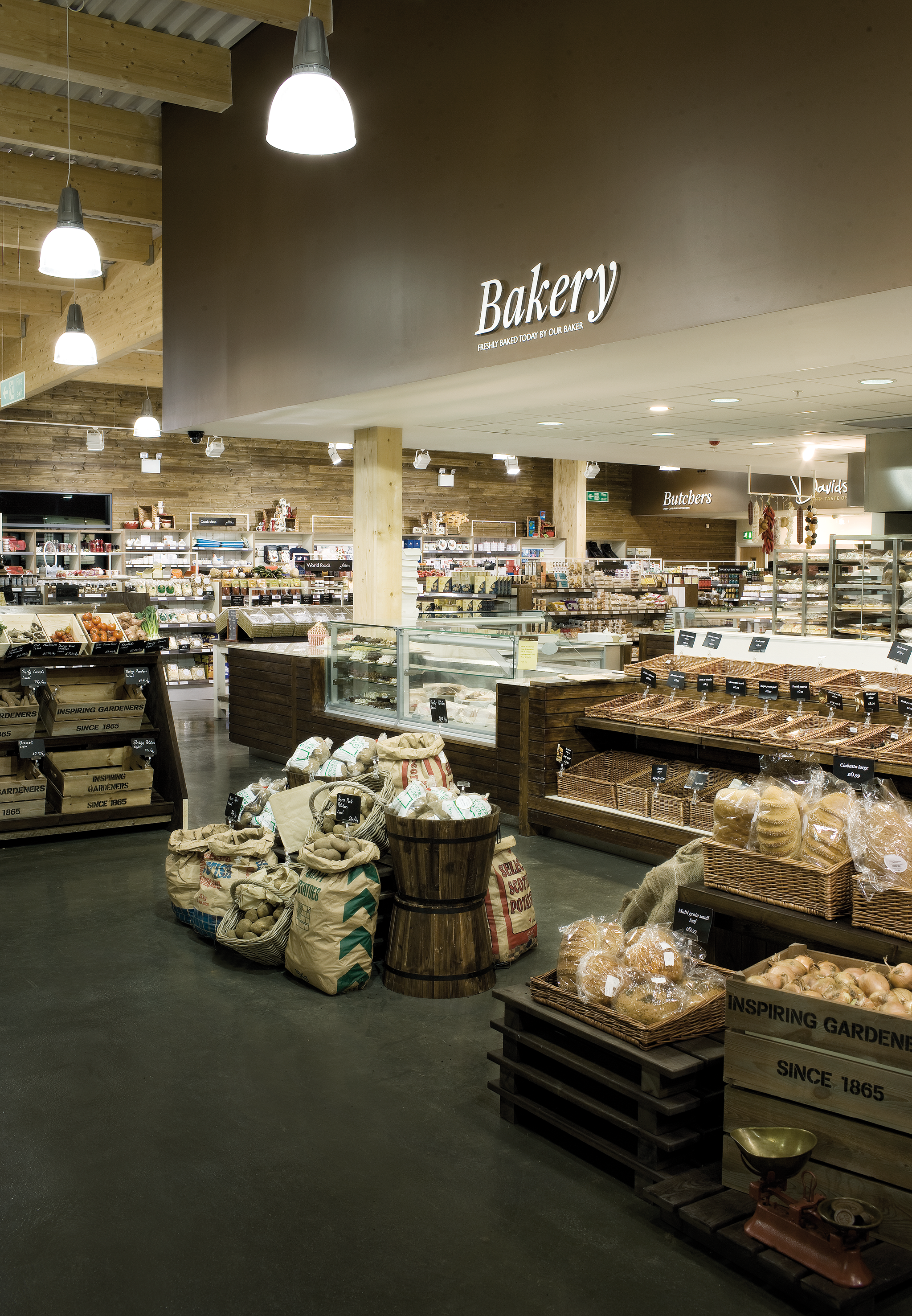
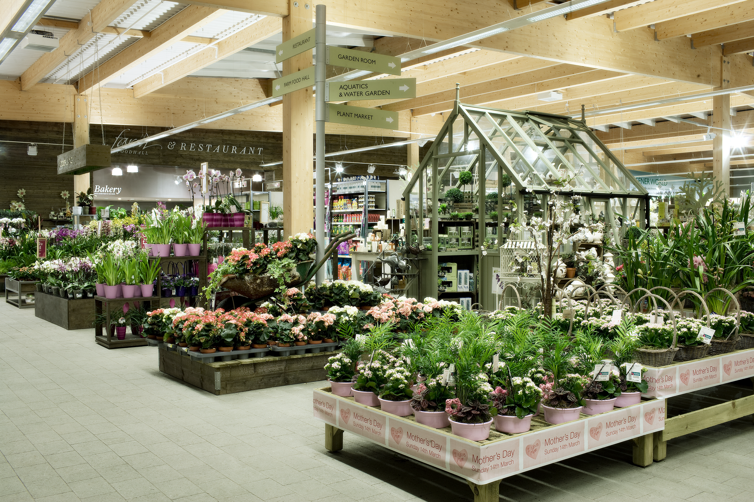
A framework was developed to structure the store; working around the grid to create an imposing entrance, a main axis, anchor points at corners, hierarchy and visual pause points. The large store size and diverse product offer is managed by establishing two zones; one focused on retail sales, the other, comprising a restaurant and Farm Foodhall, on food; each with a different look and feel; divided by a huge, timber clad feature wall, an architectural anchor providing separation but also a sense of cohesion.
Results were a runaway success, culminating in a UK rollout and a purchase by Tesco.
260% increase in customer numbers
Circa 3 fold increase in total site sales
7 fold increase in Food sales
3 fold increase in Restaurant sales
Indexes c175% of Dobbies average for sales; old store indexed c75%
Site profitability expected to double.
Number 2 store for sales; previously 16th
Explore further . . .
Post office
Original Penguin


